Color is perhaps the most impactful and instantly recognizable aspect of any visual design. It is used to draw attention, evoke a mood, or convey a message to the viewer. From logos to websites, from advertisements to brochures, colour is the key to a memorable, impactful and ultimately effective design.
It isn’t enough for designers to pick colors based on personal taste; they need to understand the psychology of colors and the emotions they inspire. When used effectively, color can draw attention, convey a mood, and help a brand establish its identity. Poor color choices can confuse, distract, or even alienate users.
A primer on color theory
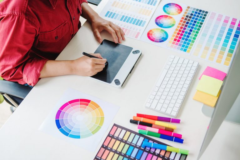
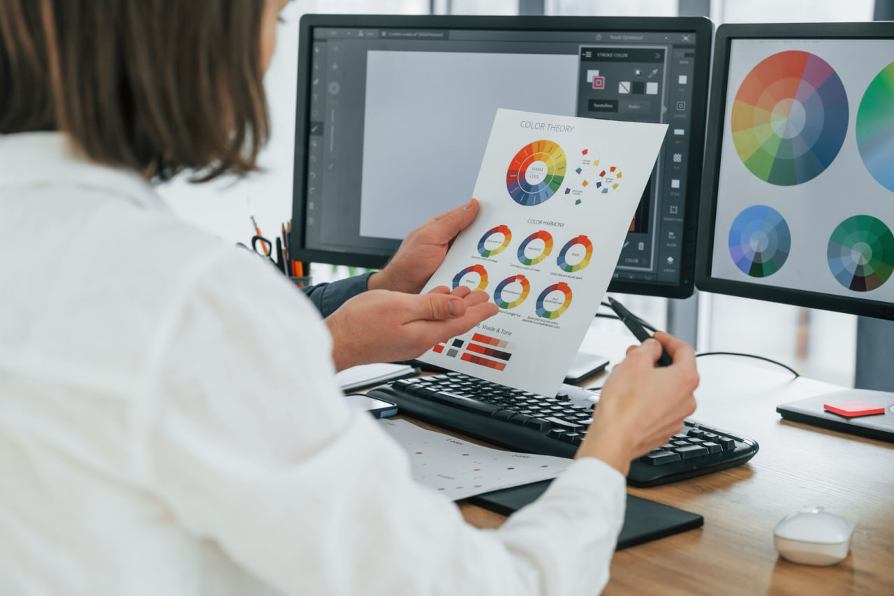
But before we dive into the psychology of colors, let’s start with some basic color theory principles. Colors are divided into primary, secondary, and tertiary. Colors can also be complementary, analogous, triadic, etc.
Primary Colors
Red, blue, and yellow—these are the basic colors used to create all other colors and have their own cultural and emotional meanings.
Secondary and Tertiary Colors: The resulting colors when primary colors are mixed (green, orange and purple) and then when primary colors are mixed with secondary colors, tertiary colors are created, giving the designer a wider range of colors to elicit specific emotions.
Color Harmony: Opposites Attract – Colors directly across from one another on the color wheel are called complements. They are striking when used together and can produce bold visual effects.
Analogous Colors Colors that sit beside each other on the color wheel for a harmonious and uniform effect, typically used in backgrounds, gradients and muted patterns.
Triadic: These colors are equally spaced around the color wheel and provide a high contrast ratio with enough balance for dynamic visual interest. Knowledge of this color scheme enables designers to control the visual appeal and emotions.
Colors and Emotions: How Do They Relate?
Of course, colors have different emotional connotations, that are subjective and can vary depending on the cultural background, the context or personal history. However, as designers, we exploit them as they carry a meaning.
Red = Energy, passion, urgency. Used to draw attention or prompt people to take action. Ideal for calls to action, warnings or promotions.
Blue is associated with feelings of trust, serenity, and dependability. Corporations, medical institutions, and tech companies commonly use blue to give the impression of stability and security.
Green Color Symbolism Green symbolizes growth, nature and balance. Often used in environmental, health and wellness designs to evoke a calming and rejuvenating atmosphere.
Yellow: yellow conveys warmth, positivity and happiness and can give an energy to a design but use it in small amounts, too much is over-powering to the eye.
Orange The color of red and the warmth of yellow. Often used to invite interaction, to entice hunger in food designs, or to draw attention to details.
Purple: This color represents opulence, creativity, and wisdom. It is often used for luxury items, creativity and artistic brands.
Black and White. Black represents power, luxury, and refinement, and white represents innocence, purity, and transparency. They are timeless, and work well together.
The Importance of Color in Branding
Color plays a significant role in branding. The colors you choose for your brand influence your personality and brand recognition. For example, you might have a primary color representing your brand that mirrors the brand’s value. Secondary colors enhance and support the primary color as well as create the hierarchy in visual design.
All branding elements from the logo, to the website, to the social media to the packaging should also have the same color, so that color is the very first thing you associate with that brand. Plus, designers have to keep in mind the color of digital screens, printouts, and the physical product.
Color Based Visual Hierarchy
Contrast color directs the viewer’s eye. Elements that are in bright, bold colors tend to stand out, while elements in muted colors tend to fade into the background. For example, bright colors might be used to make buttons and calls-to-action stand out, while muted colors are used for backgrounds and secondary text.
Color contrast is also used to guide the user’s attention. By using a dark background and light accent color, the user’s eye is drawn to things like text, buttons and icons, thereby enhancing user experience and interaction.
Contextual and Cultural Factors
The meaning of different colors is not absolute, but depends on the context of culture and custom. While in some societies red signifies good fortune and wealth, in others it implies menace or rage. While green may denote growth and harmony in one setting, in another it may suggest jealousy or disease. In order to effectively transmit their intended meaning, graphic designers who operate in a global environment need to be aware of the varying implications of colors.
Context plays a role too. For example, in a medical context blue conveys confidence, while in the context of food, red and yellow are associated with appetite. It’s important to understand the cultural and contextual connotations.
How to Get the Most Out of Color
Keep your color palette consistent and not over-complicated. As a rule of thumb, choose a primary color, secondary color and maybe one or two accent colors.
Check your color combination for accessibility. You want to make sure there is enough contrast between your text and background colors so everyone, even people with vision conditions, can read your text.
Don’t just decorate with color. Instead, use it to communicate your message. Each use of color should have a reason behind it, whether it’s to direct the viewer’s eye, evoke a feeling, or add to your brand’s personality.
Play around with gradients, overlays and transparencies to add some dimension and interest but don’t over do it. Make sure the style is consistent across all components for a more professional look.