The structure of your design. Without a solid composition, even the most gorgeous graphics and illustrations aren’t enough. A good composition directs the viewer’s attention, sets the order of importance, and achieves equilibrium, and makes the design appealing and accessible.
Knowledge of the laws of composition helps designers communicate their message, emphasize the most important parts and create the feeling of a well-designed project. Proper layout turns a mess of visual components into a well-structured beautiful visual journey.
Visual Hierarchy Fundamentals
The visual hierarchy is the way the viewer’s eye is lead through a design. It can be used to convey what is most important and to make sure the viewer does not miss certain information.
SIZE AND SCALE Larger items will be noticed before smaller ones. Headings, key images, and icons should be larger than secondary information. Scale can also indicate priority, closeness, or relatedness.
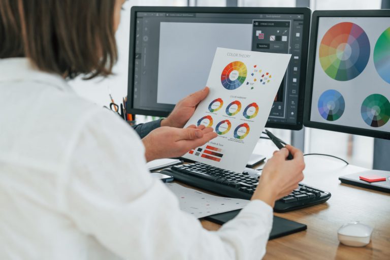
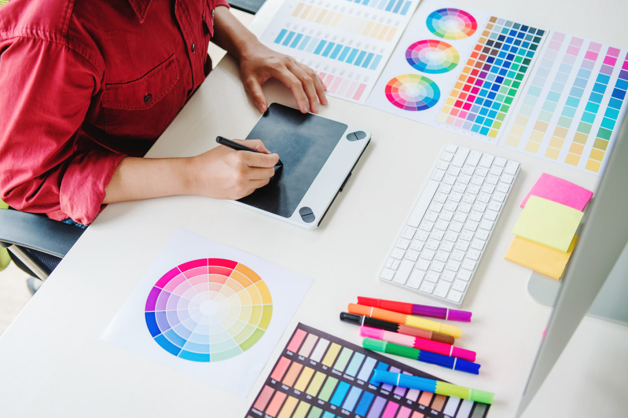
Color and Contrast: Contrast, in terms of color, value, and texture, can lead the viewer’s eye to the focal point. Warm colors will come forward in a composition, and cool colors will recede.
Bold or stylized font (text) to highlight headings. Regular, legible font to support copy. Mixing weights or styles of font to create hierarchy and support reading.
Spacing and Alignment. Spacing gives the elements enough breathing room, which enables the user to see everything clearly. Alignment enables cohesion. It gives the design a sense of structure and rhythm that helps the viewer’s eye flow through it smoothly.
Balance: Symmetry and Asymmetry
Balance refers to the way the visual elements in a design are arranged to create a sense of stability or equilibrium. Balance can be achieved through symmetrical or asymmetrical means.
Formal balance. Also called symmetrical balance, this involves arranging elements around a central axis so that the left and right sides mirror each other. Formal balance creates a sense of order, stability, and formality. It is often seen in business and professional designs.
Asymmetrical Balance. Different size, color or weight elements are distributed irregularly but still balanced. Asymmetry can create energy, tension and contemporary style, and makes the composition look more dynamic.
Grid Systems and Alignment
Grids are useful for regularising the arrangement of objects, and for keeping the objects aligned.
MODULAR GRIDS This grid system contains rows and columns that serve as guides for placing copy and images. Use a modular grid to create magazines, brochures, and web pages.
Baseline Grids Using a baseline grid helps achieve a consistent baseline, which establishes a visual rhythm and makes long-form text more readable.
Alignment When all elements are aligned to the left, to the right, centered, or justified, there is a clear relationship between elements. Without alignment, elements may appear chaotic. Alignment helps create an overarching feeling of order.
Making the Most of White Space
White space (negative space): Space between and around objects. The use of white space in visual composition creates legibility, clarity, and balance.
White space creates separation, prevents overcrowding, and provides the eye with a resting place. Adequate use of white space can give an otherwise busy design a clean and polished appearance.
How to Create Flow and Motion
Strong composition helps the eye move through a composition organically. We use lines, forms and placement to help guide the eye.
Leading Lines
Lines (either literal or suggested) that guide the viewer to focal points or elements in a scene. Example: paths in illustrations, arrows, or repetitive visual elements.
Directional Cues – When an object or shape points to something, it encourages the viewer to look at it. This can be an eye-line, where a person is looking in a direction that the viewer follows, or an actual arrow.
Z-Pattern and F-Pattern Layouts These patterns mimic the way people read, particularly on the web. By positioning key elements on these pathways, designers can make sure they get noticed.
The Principle of Contrast And Visual Interest
Contrast maintains interest and avoids boredom. Contrast can be created with color, scale, shape, or texture.
High contrast can be used to draw attention to important information and details, but low contrast is what helps to create levels and dimension in a design. Using different textures or mixing nature-inspired elements with geometric shapes can be interesting, but it shouldn’t distract the eye.