Although graphic design is done for both print and digital platforms, they have different constraints, possibilities and communication purposes. Print includes billboards, magazines, newspapers, etc. Print designing considers the paper size, ink, finishings, etc. On the other hand, digital graphics are used for websites, apps, emails, social media, etc. For digital, you have to consider the resolution, responsiveness, clicks, and more.
This is important because it helps you create work that will function, look good, and work well for the medium it’s intended for. What works great on screen, won’t necessarily translate to print and vice versa. Being aware of the strengths and weaknesses of each medium will help guide designers in their technical and creative decisions.
Fourth, how clear is the image that the camera takes? The resolution of a camera is measured in megapixels. The higher the number of megapixels, the higher the resolution. A higher resolution camera can take clearer pictures. There are other factors that effect the picture quality, but if you have a higher megapixel camera, you have a better chance at taking clear pictures.
Resolution is probably the biggest distinction between print and digital.
Print Design: When it comes to print design, the image needs to be at a high resolution of at least 300 DPI (dots per inch). This is because a low-resolution image may become distorted or blurry if it is printed. Another important consideration in print design is the concept of bleed, trim, and safe zones, which ensure that the content does not get cut off on the edges.
Digital Design Images for digital media (websites, social media, apps, etc.) are typically between 72 and 150 PPI, depending on what the image is being viewed on. The goal is to have the image load as quickly as possible but still look decent. The file size vs. resolution debate is especially relevant when dealing with responsive designs.
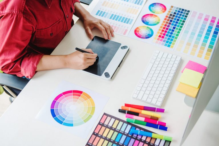
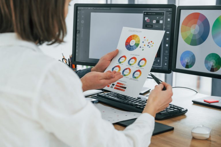
Color management
However, colors appear differently on screen and in print, so a little color management is required.
Print Design — This is where things can get a little tricky. CMYK (Cyan, Magenta, Yellow, Black) is the colour mode used for print because it combines different inks to make other colours. This can cause colours to look different from the way they appear on your monitor, because of the type of paper they are printed on, the way the ink soaks into the paper, and other various reasons. Many designers will print out their work to check on the colours and make any necessary changes.
Digital Design: RGB (Red, Green, Blue) colour model is used in digital. The additive mixing of light will produce the colour. This can often appear more luminous and vivid in digital compared to print because there are colours that cannot be produced in print. Additionally, the presentation of the screen is important, whether the screen is bright or dim, if it is a phone or computer screen etc.
Font & Clarity
The medium and the context influence the typography.
Type in print, though, is typically read from a standard distance so consistent font sizes and leading are advantageous. Though fonts can still be scaled up or down to good effect, there’s no way to control the wide range of possible reading conditions so designers must instead focus on creating a clear typographic hierarchy to help lead readers through the content. They can also get creative with minimal texture, kerning, and paper treatments.
For Digital Design The resolution of the screen, responsiveness, and size of the device must be considered when designing with type digitally. The type should be legible at different sizes, and web-safe fonts are frequently used for digital design because they are more likely to display consistently on different browsers and devices. Line length, leading, and contrast should also be considered for digital type because it will make it easier for readers to read.
“Composing a screen means putting the elements in the visual environment together in such a way that a harmonious unit is produced” (from The Wadsworth Handbook, 8th ed.).
This is a big difference between designing for static media and designing for interactive media.
Print. In print, the canvas is fixed and rigid, so you have full control over the positioning of elements. You can make use of grids, margins and alignment to assist you in structuring your design. You can also use the physicality of the printed matter to engage your audience. You will also need to think about folds, binding and the order of pages if you’re designing a multi-page document.
Digital Design Finally, if the design is intended for digital screens, it will need to be designed for a digital platform where the screen size is often unknown, the content can be scrolled through and scrolled passed, and has the potential to have buttons, hover states and transitions. A digital design could involve designing with a flexible grid, creating images that are scalable, and creating modules of content to be used across multiple platforms.
FILE FORMATS & PREP
Make sure your files are prepped for the medium you are designing for.
Print Design: Files can be provided in a variety of formats, but most common are PDF, EPS and TIFF. The file may also contain bleed, crop marks and have fonts embedded for print production. They should be proof read and pre-press checked before print.
Digital Design Digital designs are typically exported in PNG, JPEG, SVG or GIF formats, suitable for web or mobile applications, and will also require considerations such as file compression, transparency and platform compatibility.